Note
Go to the end to download the full example code
Clipping Detection#
Identifying clipping periods using the PVAnalytics clipping module.
Identifying and removing clipping periods from AC power time series
data aids in generating more accurate degradation analysis results,
as using clipped data can lead to under-predicting degradation. In this
example, we show how to use
pvanalytics.features.clipping.geometric()
to mask clipping periods in an AC power time series. We use a
normalized time series example provided by the PV Fleets Initiative,
where clipping periods are labeled as True, and non-clipping periods are
labeled as False. This example is adapted from the DuraMAT DataHub
clipping data set:
https://datahub.duramat.org/dataset/inverter-clipping-ml-training-set-real-data
import pvanalytics
from pvanalytics.features.clipping import geometric
import matplotlib.pyplot as plt
import pandas as pd
import pathlib
import numpy as np
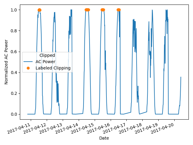
First, read in the ac_power_inv_7539 example, and visualize a subset of the clipping periods via the “label” mask column.
pvanalytics_dir = pathlib.Path(pvanalytics.__file__).parent
ac_power_file_1 = pvanalytics_dir / 'data' / 'ac_power_inv_7539.csv'
data = pd.read_csv(ac_power_file_1, index_col=0, parse_dates=True)
data['label'] = data['label'].astype(bool)
# This is the known frequency of the time series. You may need to infer
# the frequency or set the frequency with your AC power time series.
freq = "15min"

data['value_normalized'].plot()
data.loc[data['label'], 'value_normalized'].plot(ls='', marker='o')
plt.legend(labels=["AC Power", "Labeled Clipping"],
           title="Clipped")
plt.xticks(rotation=20)
plt.xlabel("Date")
plt.ylabel("Normalized AC Power")
plt.tight_layout()
plt.show()
Now, use pvanalytics.features.clipping.geometric() to identify
clipping periods in the time series. Re-plot the data subset with this mask.
predicted_clipping_mask = geometric(ac_power=data['value_normalized'],
                                    freq=freq)
data['value_normalized'].plot()
data.loc[predicted_clipping_mask, 'value_normalized'].plot(ls='', marker='o')
plt.legend(labels=["AC Power", "Detected Clipping"],
           title="Clipped")
plt.xticks(rotation=20)
plt.xlabel("Date")
plt.ylabel("Normalized AC Power")
plt.tight_layout()
plt.show()
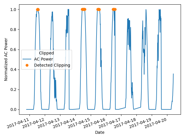
Compare the filter results to the ground-truth labeled data side-by-side, and generate an accuracy metric.
acc = 100 * np.sum(np.equal(data.label,
                            predicted_clipping_mask))/len(data.label)
print("Overall model prediction accuracy: " + str(round(acc, 2)) + "%")
Overall model prediction accuracy: 99.2%
Total running time of the script: (0 minutes 0.466 seconds)